Category: Tutorial (Page 1 of 2)

Supplice spriting timelapse #1

I’m busy with all kinds of projects as usual, however I thought recently that I could record myself working on some game artwork and create a kind of time-lapse video with some commentary what I’m doing and why. :) And while it’s not a proper tutorial, a look into someone’s workflow can still be interesting and helpful. Here’s a first video where I clean up and paint-over the 3d renders of the weapons to create proper gun pickup sprites for the Supplice Doom project. I plan to make more soon, covering making sprites and textures from scratch.

Thanks to James Paddock for the great music I could use in the video!

Introduction to shading

Very often, I encounter starting out artists who consider line art drawings and shading/rendering work as two separate things, the second one being more professional, harder, more demanding, etc. I don’t understand that division, since both are just a method of representing three dimensional objects in the 2d space. They require the same knowledge – what exactly?

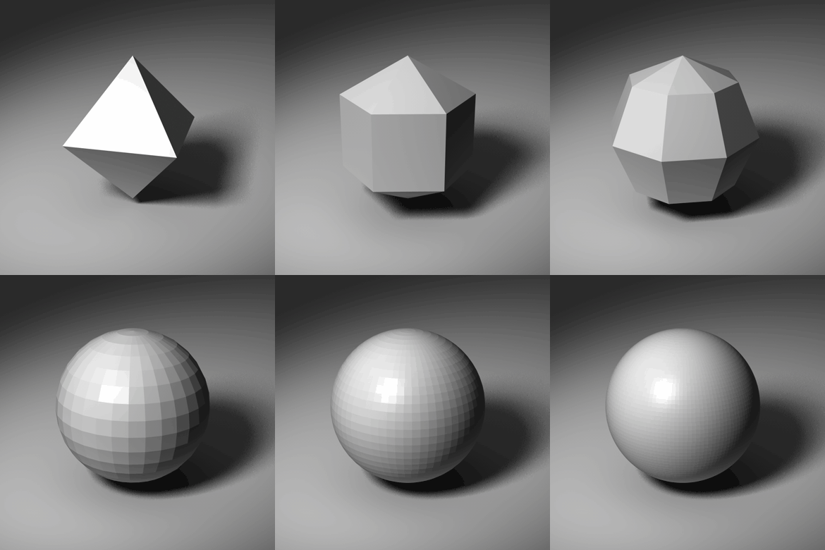
What you need is the awareness of the 3d forms behind what your drawing – especially, the planes, which compose those forms. It’s easier to think about them in case of angular figures, but what about spherical or cylindrical forms? Exactly the same as the others. As you probably remember from your maths class, a sphere has infinite number of planes. As an example of this, here’s an computer rendered example of an angular shape, progressively expanded into something more spherical, but still not a perfect sphere. It’s easier to think of simple objects first – and simple objects can always be expanded to be more complex or smooth ones.

Read More

Water animation pt. 2 – After Effects

Hello there, in this part we’ll take the same ideas and principles as in part one, but this time, we’ll use a tool much better suited to what we want to do – Adobe’s After Effects. ;) As usual with Adobe Software, if you’re new to it, it can be pretty complex, so I’m bound to give you a brief introduction to the software first.

Read More

Water animation pt. 1

I’ve always like the effect applied to water textures in the Quake1/2 engine/games and, as a Duke Nukem 3d/Build modder, I was envious of the engine-generated warping animation available in ZDoom. :) It looks good and it’s pretty time-saving, since you don’t have to animate the texture by yourself. I wouldn’t be myself if I’d give up on the idea, so I’ve decided to work out a method for a nice water animation than can be made quite quickly and without too much fuss. Unfortunately, this can’t be really done well and quickly just inside Photoshop, but we’ll get to that.


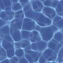
Here’s our procedurally-generated test patient

Read More

Door texture walkthrough

Here’s a walkthrough of a door texture I’ve made for Supplice (One of the many), the focus is on the process, the tools/options are covered in another article. :)

The idea


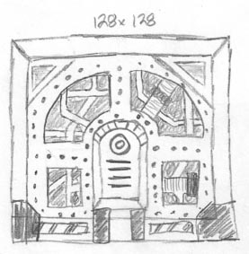
Mechadon’s pencil sketch

It’s best to start with a sketch – it doesn’t matter if it could pass as an Moebius’ drawing or if it’s ugly as heck – it’s purpose is just to get the idea out of your head and spare you the trial and error you might encounter when “just jumping in”. Of course, it’s nice to do some improvisation! Sketch as many details as you deem fit.

The one on the left is not my drawing, it’s one of the texture idea sketches made by Mechadon for Supplice. Well, it’s nowhere close to the old masters’ but it’s pretty clear what’s going on. ;) Mechadon is a pretty cool guy and I don’t have to be too strict, since he’s open to my interpretations. Thanks to this sketch, I know where the details should be placed and their general look, so I can focus on specifics later. Once I’m done with the final texture we’ll compare it with the sketch.

Read More

Introduction to blending modes

Layer based workflow in graphics software started out as a special feature and grew to be a standard in most applications today, even in freeware. The idea of working on layers really isn’t new, light tables and cell animation have been around for a long time, they’re a material for a different story, though. ;)

Lowering opacity and blending modes are a part of the layers functionality – while transparency/opacity is pretty self-explanatory, the blending modes are a special way, you can choose, the layer is displayed and how it interacts with the artwork placed below it. You can use transparency with blending modes together, for even more possible results.

Read More

From modern to low tech – getting the light info out of normal maps

When you’re working on low-tech game art, you might need, or want to, adapt an modern, shader based material as a texture. In the old days, an artist had to paint in all the details from the texture, as lit from a light source he chose. Nowadays, the artist supplies only the raw color and height data, and the texture is lit by the game engine, based on the light sources placed by the level creators, dynamic lights, etc. The technology of bump and normal mapping gives only an illusion of depth – while the object appears to have three dimensional detail, the surface is still flat.

Read More

Downscaling and resampling filters

If you’re doing low resolution art, sooner or later, you’ll encounter something you’ll need to scale down – high resolution photo or generated textures, renders, etc. Which filtering method works best?

For my example, I’ve used a texture from http://www.texturemate.com/. Let’s take a look at Photoshop’s resize dialog (image → image size)

Read More

Conversion to 8-bit palette

If you ever worked on a mod for an old-game, or made your own, old-school styled one, I’m sure you’ve had to convert your artwork to an 8-bit, 256 colors max, palette – either because of the supported file format, or you just had to fit the artwork into already established palette. In Photoshop you do this through the image mode indexed color dialog. Let’s have a closer look at it, with all options explained.

Read More

Colorizing and remapping with gradient maps

As you might know from my other tutorial, I create ny textures for my old school mods in grayscale most of the time. To add some color to them I use gradient maps, they’re also really great for adjusting the colors of your image to prepare it for 8-bit.

Read More

Page 1 of 2

Powered by WordPress & Theme by Anders Norén