
When you’re working on low-tech game art, you might need, or want to, adapt an modern, shader based material as a texture. In the old days, an artist had to paint in all the details from the texture, as lit from a light source he chose. Nowadays, the artist supplies only the raw color and height data, and the texture is lit by the game engine, based on the light sources placed by the level creators, dynamic lights, etc. The technology of bump and normal mapping gives only an illusion of depth – while the object appears to have three dimensional detail, the surface is still flat.
Who’s your normal, and what does he do?
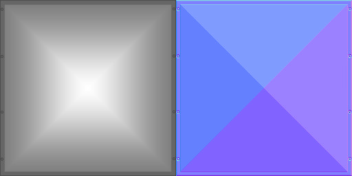
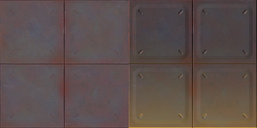
A bump map and a normal map. While they do similar things, they look vastly different.
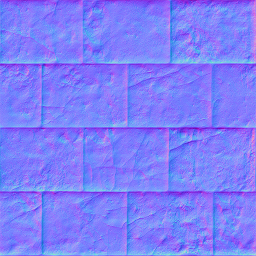
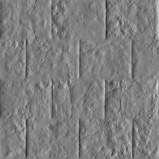
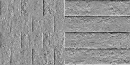
Normal maps are further refinement of the bump mapping technology. Bump mapping is based on height maps – grayscale pictures, in which the black color means the lowest point of the “depth”, and white means the highest, everything in-between being lighter, or darker gray. The normal maps use all three RGB channels to provide the “surface direction” data to the engine, which gives a little more precision and control to the end result. While bump maps are pretty clear to visualize, normals seems weird with all that neon color look. Let’s do a little vivisection of one. ;) In order to properly extract data from a normal map, you should know how they work. For demonstration, I’ll be using an material from Metal & Stone texture pack available on http://opengameart.org:
“Well then let’s have a look at it, mr Gumby!”
In order to have a proper look at a normal map, you need to have access to the channels palette. Go to window → channels, from the top menu. By default, the channels tab is available in the layers palette. Once you’ll get to see each channel on it’s own, things start getting clear.
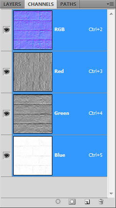
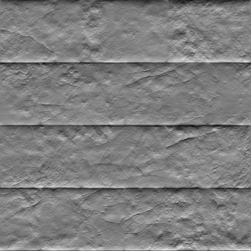
This is where the “directionality” comes from. The red channel features the textures light in the “x-axis”. What is lit and what casts a shadow depends or whether the part of the texture is an inset or outset. This also depends on the engine, some engines, or texture formats, require the highlights and shadows to be inverted, in order for the normal maps to work properly. In case of this normal map, the surface appears to be lit from the right side.
The green channel is similar to the red one, except it features only the light in the “y-axis”. In this case, we can see all the surface details as lit from bottom.
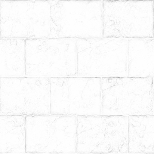
The blue channels is a little different. It features the texture as evenly lit from a light source “in front” of the texture, a light being perfectly perpendicular to the texture in every spot. This results in the surfaces which are perpendicular to the view point/light source perfectly white, and the surfaces which face away from it, are gray, being darker the more steep the angle.
Let’s copy out the channel data into normal layers. Click on the color channel, select the whole image with ctrl + a and then copy. Make sure, that you’re back in RGB space (just click on the RGB field above the individual channels) when you want to copy back. I think it’s best to get the blue channel out of the way first. I’ll open the color data texture, and paste in the blue channel, and give it the multiply blending mode. This will cause the white pixels to become transparent, and the grey pixels will darken the picture below. This will result in a subtle “ambient occlusion” like effect.
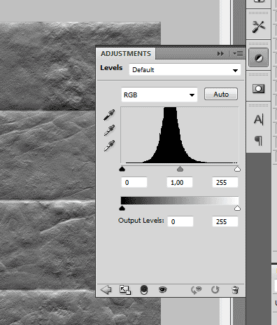
If you want “more”, you can duplicate the layer or adjust it with, for example, image → adjustments → levels.
I’ve copied out the red and green channel. I’ve decided I’d like the texture to be light from top-left, so I’ve inverted the colors with image → adjustments → invert.
Since the inversion darkened the flatter “middle ground”, I’ve adjusted the middle gray with levels. This step is texture specific and might not be necessary.
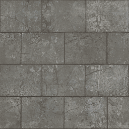
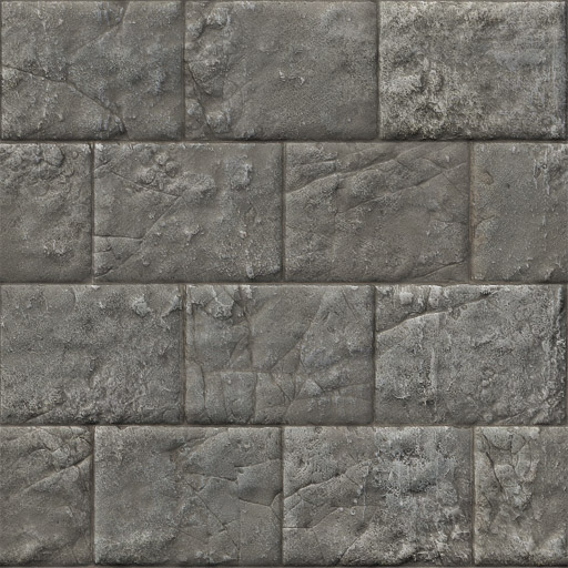
Next, I’ve pasted both of the adjusted channels on top of my texture with the blue-channel layer, and gave both the red and green channel an overlay blending mode. You can use other ones, the ones from the overlay group work best IMO. Since now the texture looks like lit from an light source placed at a perfect 45° angle, I’ve lowered to opacity of the x-axis light/red channel to 60%. This results with the light appearing to be tilted towards the top. Here’s my result:
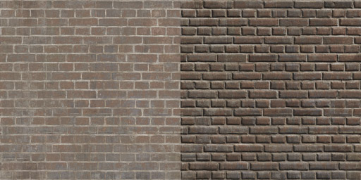
Remember, you can always adjust the contrast in light layers themselves, adjust their opacity, clone the layers to enhance the effect, and invert the lighting (or not) in the R/G channels. Here’s some more examples.
And an example of an additional pass, to add an extra light.
Addenda:
You can try working directly on the color layer/all three channels using options like image → adjustments → black & white, or channel mixer with the monochrome option checked on, but this may require a lot of trial and error, and you still might need to invert the r/g channels first. If you’d like to try this method, I recommend you get rid of the blue channel first, I think it gets in the way using this method – just fill it with black. I still think the method above is simpler to execute and grants a large control over the results.
Leave a Reply