
Here’s a walkthrough of a door texture I’ve made for Supplice (One of the many), the focus is on the process, the tools/options are covered in another article. :)
The idea
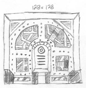
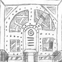
Mechadon’s pencil sketch
It’s best to start with a sketch – it doesn’t matter if it could pass as an Moebius’ drawing or if it’s ugly as heck – it’s purpose is just to get the idea out of your head and spare you the trial and error you might encounter when “just jumping in”. Of course, it’s nice to do some improvisation! Sketch as many details as you deem fit.
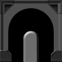
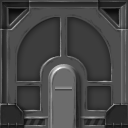
The one on the left is not my drawing, it’s one of the texture idea sketches made by Mechadon for Supplice. Well, it’s nowhere close to the old masters’ but it’s pretty clear what’s going on. ;) Mechadon is a pretty cool guy and I don’t have to be too strict, since he’s open to my interpretations. Thanks to this sketch, I know where the details should be placed and their general look, so I can focus on specifics later. Once I’m done with the final texture we’ll compare it with the sketch.
Starting out!
I start off with a perfect midtone, with no color whatsoever – a middle gray tone (R: 128, G: 128, B: 128). Almost all Hacx and Supplice are made in grayscale and colored with gradient maps once finished – I usually work like this in case of “lo-tech” textures/artwork, unless I have to fit something to an already established style (Doom texture pack for example).

In my interpretation, the whole texture is in an indent – so the first element I create is the beveled border. On a new layer, I’ve created a square and edited the layer style options – to access it, go to the layer palette and double click on the space to the right of the layer’s name.
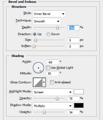
Bevel and emboss layer style
The effect I’m using is bevel & emboss. Size, soften and the highlight/shadow opacity options are pretty self explanatory. The depth setting is pretty important, since it adjust how the bevel behaves – whether it’s a soft or an straight angle bevel. High depth makes the light behave like on a straight line – I use high depth bevels almost always, in this texture too. Adjust the light’s angle accordingly to the light source – I’ve chosen the top left corner. The “use global light” makes all the bevels use the same light direction settings – since I’m going to need various bevels, behaving differently, I’m turning it off. I recommend, that you use low/middle amount of opacity of the highlight/shadows. At this stage, we’re keeping everything low contrast and rubbery looking.
I’m usually using a separate layer for every shape, that’s how I like to do things – I do this so you can use the different layer style settings on the shapes and turn their visibility on, or off, if I need to show/hide some of the details. Of course, you can have more shapes on one layer, but they will all share the layer style behavior.
More layer style details
I’ve darkened the texture a bit and created some more details – I’ve added the top indent/vent corner thingies, the rounded center-piece and bottom corner details. The last ones are actually copied and edited from another Supplice texture, but they’re made the same way as the rest of the door, described further below. The rest are more of the shapes with layer style effects. The middle piece uses an “almost default” drop shadow effect – I’ve reduced to size and distance to 3 pixels and opacity to ~40%. The default setting for drop shadow is to big and too intense.

The mask shape on the left, cutouts and effects implemented on the right
The general shape for the inner piece, which will feature most details, is in place. It’s an indent in the surface, but without a visible bevel of the edge. Later, I’ve clipped it into proper shape using a layer mask, reduced the fill % (The opacity % works for the whole layer, while fill is the opacity of pixels making up the layer, leaving the opacity of the layer style effects intact) and added a dark inner glow to highlight the outer edge, a subtle bevel and emboss (on the outer bevel setting) and an inner shadow (From top) for a better feel of the third dimension. The two top corner indents also had their fill % reduced and an inner shadow applied.
In general, our base for the texture is done, we’re nowhere near done yet, though! ;) Kiss the layer styles goodbye, and grab your trusty tablet stylus.
The brushwork
We have to set up the brush tool first – select the brush tool (B) and push F5 to open the brush configuration. Select the first brush – the default 1 pixel hard brush (it’s hardness should be 100%, if it’s not, adjust it). Keep the size, since we’ll be doing pretty precise stuff in low resolution, one pixel is all we need.
Access brush settings with F5
In shape dynamics select the “control” setting under size jitter and set it to “pen pressure”, set this option to opacity control too, in other dynamics. This further enhances the dynamics of your line – if your lines will be too faint you can turn this off. We’re using the size control with pressure, and since brush can’t really be smaller than 1 pixel, the effect is lesser opacity. Bigger brushes need a different set up to work well, but I’m usually not using them for Doom stuff, in case you need a bigger brush and want to keep the setting, use the [ ] bracket keys shrink and enlarge your brush. Use the same set up for your eraser tool. A little extra tip: when painting wear and tear, you can use the opacity jitter % control for scratches – this will make the opacity of the brush fluctuate by a random amount (limited by the set percentage).
My method, is to use the black & white colors, since we’re in grayscale. I’m using the default (press D) pure black and white colours, controlling their intensity by using the pen pressure – As already mentioned I’m using both size and opacity control, since I shade the textures very gradually and have no need for placing highly opaque strokes. (You still can though, when you press harder). For convenience you can press the X key – it will switch between the two colors (b&w in this case) so you don’t have to use the color picker when you switch from shading/lightening. If you end up with harsh colour transitions you can press alt while using the brush tool – it will change the tool to eyedropper so you can pick up intermediate colors and blend in the transition, afterwards, if you need to get back to B & W colors, just press D.
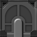
Okay, our first strokes are placed. While the method is more towards general digital painting – we use antialiased brushes with varying opacity, we’re working small, and pixel-art principles can really help us with clarity and keeping it clean. The corner vents seem to be moved, but I’ve just painted in some shadows/highlights. In general, in the painting stage we detail our lighting and edges, create some actual shine/specularity and spice the layer style-made detail – those are a no-brain, predictable algorithm which serve only as our sketch, it’s our job to really make it interesting and add some real artistic value. Trust me, it really makes a difference in the long run.
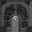
I’ve assembled the final layer style stage, the first painting stage from previous steps and next two ones together in an animated .gif. As you can see, I’ve painted in a little more detail, corrected the shape of the center-piece plus added some dark spots. The dark strokes may seem unrealistic – like there’s a bit of indent behind each edge – but it’s not supposed to. It’s a great way to add detail, contrast and texture, though, there’s more to “look at” and makes the whole thing pop out. I’m darkening a bit of every edge, highlighted or not – essentially I’m doing what the sharpening filters do, but consciously and tastefully. The strokes can’t be too defined, or the effect will be too much. Try to keep the strokes sharp towards the edge a more faded when it moves inward the surface.
I’ve created the bottom parts of the door, and more details like rivets (Painted on a new layer and copied – use the Move Tool with alt key to copy and move layers at the same time!), the middle spherical piece (Radial Gradient, Gradient Overlay layer style + painting over.) and the vent elements (Selection plus a Gradient Tool, + painting over). When copying detail, remember the move tool works only on the layer you have selected in the layer panel, or the one you’ll click on in the image, you have the “auto-select” option checked on the top option bar.
Time for the center part. Mainly, I’ve used a generic tech-greeble texture I’ve already made. It was made exactly as the door in this tutorial, except I’ve used a procedurally generated image as a base for my texture. I’ve clipped it to shape using the same mask I’ve used for the layer styled shape I’ve used earlier.
The pipe/cable details are straight 3px lines made with the shape tool (use antialasing for diagonals and turn it off for straight lines for best clarity), and simple bevel and drop shadow layer style. They’re not masked to the shape yet – if I mask them now, the bevel and drop shadow will accommodate to the cut out shape – we’ll get shadows, and highlights on the edges where we don’t want them. :) To get around this, either convert the layer-styled layer into a smart object (right click on the layer in the list and “convert to smart object”) and apply the mask afterward, or put the layer into a group and apply the mask into the group itself. You can do this with multiple layers too.
For the finishing touches, I’ve touched up the cables/pipes a bit with the brush tool, and adjusted the brightness contrast of the central part. I’ve wanted to invert the contrast, so using the selection from layers (ctrl click on the layer’s thumbnail), I’ve made a new layer, filled it with black, and then filled the shape of the pipes with white (alt+backspace fills with current color) and changed the blending mode to one from the overlay group (those modes are a mix of additive and subtractive transparency), I’ve used the overlay one, and applied the shape of the indent as a mask afterwards. Opacity of the layer controls the “amount of effect” so adjust to taste. For the new bottom part detail, I’ve just painted that in, without any layer style “sketches”.
I think I’m done here, and pretty happy with the result. You can adjust the brightness/contrast of the whole image now, add color or texture/wear, but I thought it’s not necessary in this case. I recommend you paint any damage by hand and be wary of overlaying any textures. Some might add a lot of flavor, some make the whole thing cheap. It can also make, or break, a good conversion into a limited palette. I recommend using procedurally generated stuff (filters, noise and more complex ones). Photo textures in low res art usually look out of place, even when they downscale well – watch out.
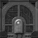
I hope that some insight to my workflow was helpful in some way. Here’s a recap of the whole process and a comparison with the original idea sketch. :) Good luck working on your own textures!

Addenda:
A little thing to add from Esselfortium from ZDoom forums. Thanks!
For the unrealistic-but-attractive™ extra shading, I typically cheat a bit and use some subtle white Inner Glow and/or some (also subtle) black Satin for a similar but lazier effect, rather than painting it in by hand, though I’ve done my share of that too. Literally any time I can get away with it, though, I abuse the hell out of Layer Styles to make my life easier.
I’ll also often pencil in some white or black straight horizontal or vertical lines and mess with their opacity and alignment in relation to the Photoshop-generated beveling, to get sharper and more defined shading on edges.
In any case, using Photoshop bevels as a base and then using some manual brush or pencil labor and/or combining them with other effects is a great technique. When I was starting out I’d try to accomplish everything within the Layer Style of a single layer, and the results would usually suck. You can also just duplicate your layers, set the Fill Opacity of the upper ones to 0% so only the layer style stuff is drawn for them, and put different effects on each so you can stack more Photoshop-automated magic.
Leave a Reply