

Very often, I encounter starting out artists who consider line art drawings and shading/rendering work as two separate things, the second one being more professional, harder, more demanding, etc. I don’t understand that division, since both are just a method of representing three dimensional objects in the 2d space. They require the same knowledge – what exactly?
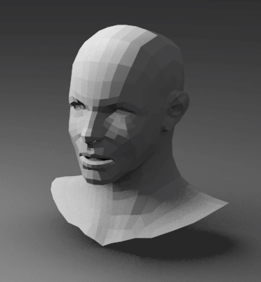
What you need is the awareness of the 3d forms behind what your drawing – especially, the planes, which compose those forms. It’s easier to think about them in case of angular figures, but what about spherical or cylindrical forms? Exactly the same as the others. As you probably remember from your maths class, a sphere has infinite number of planes. As an example of this, here’s an computer rendered example of an angular shape, progressively expanded into something more spherical, but still not a perfect sphere. It’s easier to think of simple objects first – and simple objects can always be expanded to be more complex or smooth ones.
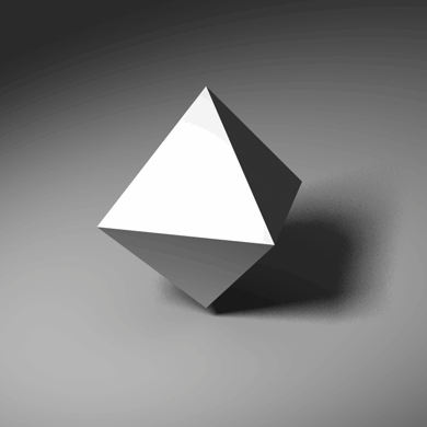
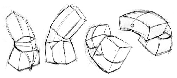
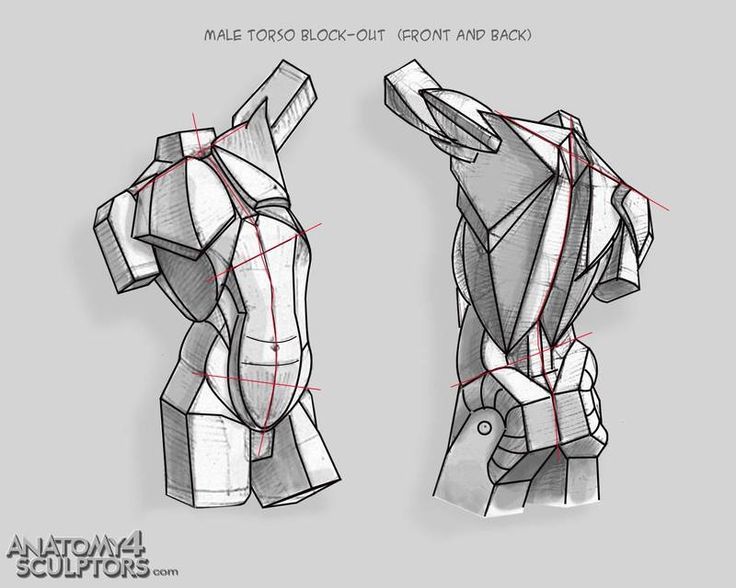
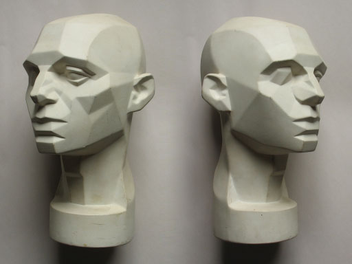
Divide & Conquer – form
As you can see, a more complex form creates more complex shading, and smooth surfaces have smooth transitions between values. It’s easier to shade angular forms. However, there’s almost no angular forms in nature and even man-made objects feature a lot of curves and curved surfaces. Still, you can simplify everything, even the human body – think of it as an angular, simpler form first, and then expand and build detail on top of it. Here’s some visual examples of this concept:
Observe!
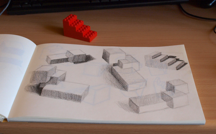
Once you’re aware of the planes, where, and at what anlge they’re placed in the 3d space, you have to know how they behave in relation to the light source(s) present in the scene. This requires a lot of conscious observation and drawing from life. Drawing nature or living models is something that can be hard to arrange, not to mention, kinda scary if you’re still starting out, but you can start small – a desk lamp and household objects work decently. Keep in mind to focus on the forms/shapes, not on what item you’re drawing. You can also do a “combined practice”, of both 3d figures in perspective (freehand, or measured) and their shading. Keep in mind that you can also build your own 3d forms, for example with LEGOs. ;) Highly recommended, since you can start with really basic things and then later build more detailed/complex objects. They can also be kept small, so it doesn’t take much space and it’s easier to try different lighting setups with a small object.
Light is very important to observe. Out of all different compontents of art like color, perspective, structure/anatomy, light can’t really be “cheated”, nor it’s possible to stylize it. Visually – yes, but it’s principles will stay the same, no matter if it’s surrealism or cartoon.
Anatomy of light and shadow
Before you get to drawing, there’s still a bit of information you should know – light and shadow have their structure. Knowing it will help you with the divide and conquer approach. ;) I think there’s no point in repeating what was already said in many art videos, so let me point you to the one I like the best – Shading Light and Form – Basics by Proko
Divide & Conquer – process
Knowledge and conciousness is not everything – a fully rendered image can be overwhelming and it might be really hard to find a place to start. Jumping in and trying to do eveything at once might not be the best idea, at least when you’re still learning. So once again, just like with the shapes – simplify. Get something basic first, so you have a reference point and build upon it. Some example approaches to help you:
Block out the areas of light and shadow
Simplify your image to two values – white and middle gray which will indicate the shadows. You can also add in deepest dark/black color and whitest (only) highlights, if you’re drawing on tinted paper. Then you gradually add more details in those zones. Imagine the gradient below as a “graph” of the value levels of your image over the time of it’s making.

Progressive – from light to dark.
Instead if blocking out the middle value first, you draw from light to dark – start from the darkest areas and draw them very light. Afterwards you go through those areas and darken them a little and add another level of value. Next you go through those areas again and add another level and so on – you gradually build your image.

Keep in mind that both approaches require you to work on the whole image at once – in the beginning in the first case, and constantly in the second. This is a good thing, since this way you can order the values in your image and create good contrast and consistency. You also get a better preview how your final picture will look, way before you finish – this allows you spot errors earlier. The closer you are to the finish line, the mistakes get harder to undo.
No colors here, buddy!
I’d recommened not bothering with color at all at the beginner stage, and focus on grayscale practice even if you’re intermediate! Despite what you may think, color is an added complexity, and some more than others, like reds or yellows for example. To add even more complexity, keep in mind that the color of the light and environment alters the color of the object you depict. Yellow, light-bulb like light might skew the color you observe into warmer hues, while a blue sky will cool down the look of the whole landscape. Beginners often forget about this which results in a coloring-book like look – the character has blue armor, so I will color it blue, the grass is green so I will make it green, etc. This a huge layer of extra complexity, so make sure to tackle it once you’re somewhat confident with your shading using the values. A grayscale picture with properly defined defined forms and good contrast is much more pleasing to the viewer than a picture with great colors but with not enough three-dimensionality – it just might make the viewer not sure what he is looking at, or what object is at what plane – for example, when two objects in two different places are depicted like they’re under exactly the same light conditions.
Go draw!
I hope you find these guidelines helpful, and you’ll feel less overwhelmed, if you’re a beginner. Remember to observe the form the objects are composed of, and how they are lit up in the real world. Draw as much as you can and, what’s most important, don’t stress over it too much and have fun!
Leave a Reply