Layer based workflow in graphics software started out as a special feature and grew to be a standard in most applications today, even in freeware. The idea of working on layers really isn’t new, light tables and cell animation have been around for a long time, they’re a material for a different story, though. ;)
Lowering opacity and blending modes are a part of the layers functionality – while transparency/opacity is pretty self-explanatory, the blending modes are a special way, you can choose, the layer is displayed and how it interacts with the artwork placed below it. You can use transparency with blending modes together, for even more possible results.
The names of the blending modes are usually the same or similar between the different software, but there’s no point in memorizing them all. In fact, which blending mode will work best is totally up to you, since some of them will give you better or worse results, depending on what you want to achieve and on what are you working, so it’s best to experiment. However, blending modes can be easily divided into distinct groups, and that’s what’s good to know, so you don’t have to take any “shots in the dark” when you’re looking for the perfect one. ;) I’ve also attached examples to give you a better idea of the effects. If you’re a technical junkie, you can find the exact formulae behind each mode in every major application – blending modes are nothing more than maths applied to color values of pixels.
The blending modes in Photoshop can be divided into normal modes, darkening modes (multiplicative transparency), lightening modes (additive transparency), combined modes, inversion modes and adjustment modes.
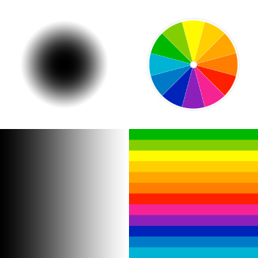
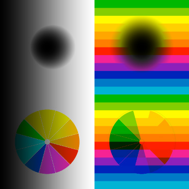
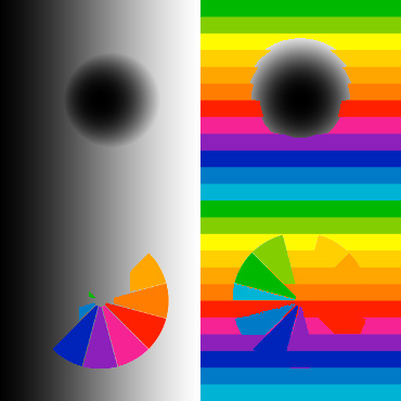
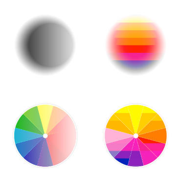
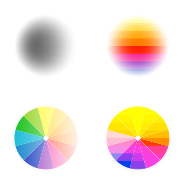
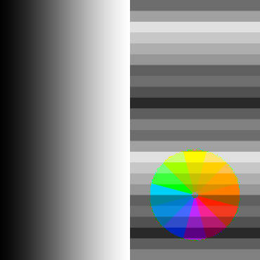
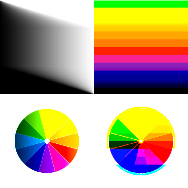
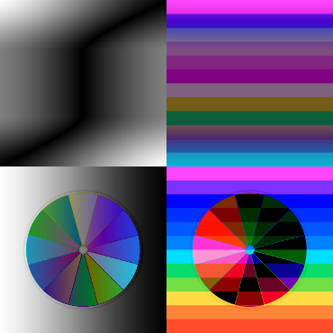
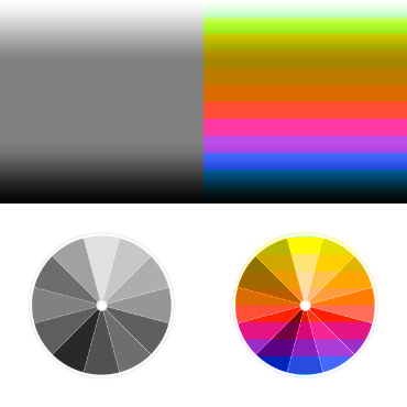
Here the images I’ll be using to demonstrate – the top images are for the layer above, and the bottom ones will serve as a background.
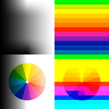
Normal modes:
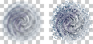
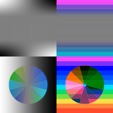
There are two modes here. Normal doesn’t alter the layer’s appearance in any way and dissolve displays transparencies as a random dithering pattern of fully opaque and transparent pixels. For preview, I’ve used a sprite with transparency I’ve had on hand. The checkerboard pattern is a standard of representing transparent pixels in modern graphical applications.
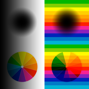
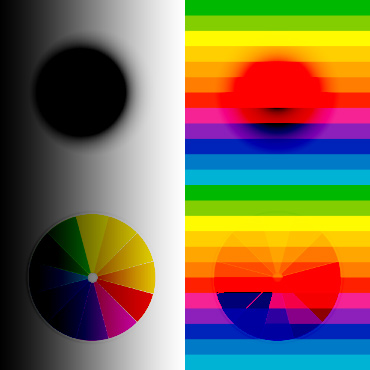
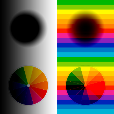
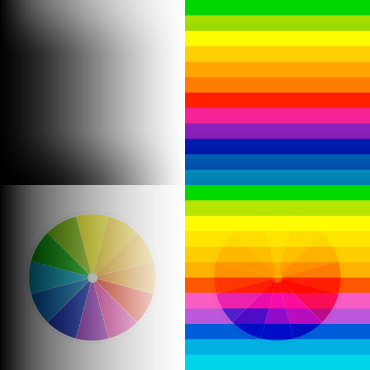
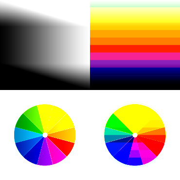
Darkening modes:
Using those modes, the layer will darken the image below. White pixels will become fully transparent and only the darker pixels will be visible.
Darken
Darken compares pixels of the layer above and below – if the above pixel’s value is darker than background, they will be visible, with some degree of fading. The darker color mode works in a similar way but more in a opaque/invisible 0/1 way.
Multiply
Makes the white pixels fully transparent and black fully opaque, with other values being in-between.
Color Burn
A high contrast mode, as you can see, it might not fade to a black color.
Linear Burn
Behaves like a more contrasted multiply mode.
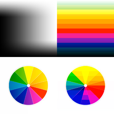
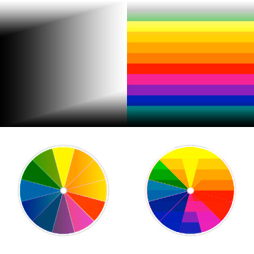
Lightening modes:
Those are the opposite of the darkening modes – black will be fully transparent while white will be opaque, or will blend with the colors below.
Lighten
A counterpart to the darken mode. Lighter colors will gradually become more visible. Both lighten and darken modes are more about “masking” a layer, instead of blending the layer below.
Screen
Standard lightening mode. White pixels will be fully opaque.
Color dodge
High contrast mode, similar to color burn. White pixels will raise the color intensity, some of the high saturated, bright colors might not fade to white.
Linear dodge
This is similar to additive transparency used in most games. White pixels will stay white, however the colors will have raised intensity which can cause color clipping as in the example.
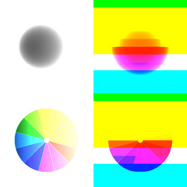
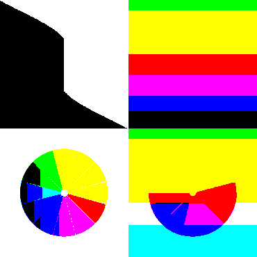
Combined/overlay modes (also known as contrast modes):
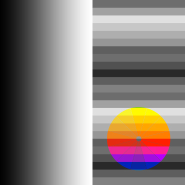
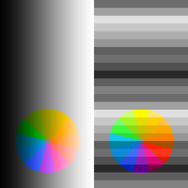
I’ve decided to call them combined modes, since they combine the characteristics of both lightening and darkening modes – white and black color will react with the graphic below, while the 50% gray color will be fully transparent, neutral color. To give you a better idea of the effects, I will be using a ramp with a larger neutral gray area instead of the radial gradient above.
Overlay & soft light
Those are basic combined modes. 50% gray will be invisible while white and black will react. Overlay has more contrast and raises intensity of colors below.
Overlay mode
Soft Light mode
Hard light
This is more like an fade mode, not a blend mode, based on the overlay principle. Pure white and black will stay that color.
Vivid light and linear light
As you can see on the gray gradient, the blend is more linear and less gradual. Vivid light is very intense.
Linear light is less intense and white and black pixels will stay their way no matter the background.
Pin light
It has the linear characteristic going on, except it fades in the layer’s base colors instead of blending with the graphics below.
Hard mix
A very harsh mix which results in heavily clipped color. Notice how in the gray-on-gray gradient, the neutral gray splits the image into 0/1 black/white values and black/white fades shift the middle point.
Inversion modes:
Those work a little differently. Layer with those, will invert the image below (Think photo negative), with it’s pixels acting as a mask – white means full opacity and black means none.
Exclusion behaves in a similar way to difference, except that it will gray out in the middle values.
Adjustment modes:
I’ve called them that because they use the pixels of the current layer to adjust the hue/saturation/lightness of the image below.
Hue
Hue takes the color (Hue) value of the layer’s pixels and applies them below. Gray (no color value) pixels will gray the image below (Foreground) or stay neutral. (Background)
Saturation
Saturation takes the color saturation value of the layer’s pixels and applies them below. Gray (no color value) pixels will gray the image below (Foreground) or stay neutral. (Background)
Color
Color takes the general color information (both hue and saturation) from the layer’s pixels and applies them below. Gray (no color value) pixels will gray the image below (Foreground) but will be colored if the in the background.
Luminosity
Luminosity takes the lightness value of the layer’s pixels and applies them below. The intensity of colors is not altered, so the colors will get a little bland when darkened/brightened.
Common use of the blending modes
Darken modes:
Shadows, using shadow maps, grunge effects like stains or scorch marks, adding color to any on-white artwork (scanned pencil drawings), removing the background from line art.
Lighten modes:
Removing background from effect graphics placed on black backgrounds like explosions, lights and lens flares, removing background from white on black artwork (blackboard for example)
Overlay modes:
Usually for textures, grunge map, pre-rendered lighting (to add both shadows and lights) and shading layers in artwork, normal or bump map derived shading maps
Other applications
As said earlier, layers and blending modes grew to be a standard, even in free software. Gimp has the biggest list available, however they’re not as neatly divided as in Photoshop. Names might be different throughout applications, keep in mind that any blending mode with addition/additive, screen or dodge will be a brightening mode and anything with multiply, subtraction/subtractive or burn will be darkening. Some names are taken from the formulas behind them, like multiply, divide, xor. In the long run, the blending mode changes can be easily reverted so experiment! This guide should give you a general idea what you’re looking for, though.
Leave a Reply