
Hello there, in this part we’ll take the same ideas and principles as in part one, but this time, we’ll use a tool much better suited to what we want to do – Adobe’s After Effects. ;) As usual with Adobe Software, if you’re new to it, it can be pretty complex, so I’m bound to give you a brief introduction to the software first.
Author: Cage (Page 2 of 3)
I’ve always like the effect applied to water textures in the Quake1/2 engine/games and, as a Duke Nukem 3d/Build modder, I was envious of the engine-generated warping animation available in ZDoom. :) It looks good and it’s pretty time-saving, since you don’t have to animate the texture by yourself. I wouldn’t be myself if I’d give up on the idea, so I’ve decided to work out a method for a nice water animation than can be made quite quickly and without too much fuss. Unfortunately, this can’t be really done well and quickly just inside Photoshop, but we’ll get to that.
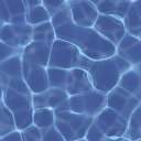
Here’s our procedurally-generated test patient
Here’s a walkthrough of a door texture I’ve made for Supplice (One of the many), the focus is on the process, the tools/options are covered in another article. :)
The idea
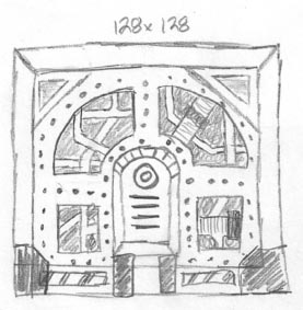
Mechadon’s pencil sketch
It’s best to start with a sketch – it doesn’t matter if it could pass as an Moebius’ drawing or if it’s ugly as heck – it’s purpose is just to get the idea out of your head and spare you the trial and error you might encounter when “just jumping in”. Of course, it’s nice to do some improvisation! Sketch as many details as you deem fit.
The one on the left is not my drawing, it’s one of the texture idea sketches made by Mechadon for Supplice. Well, it’s nowhere close to the old masters’ but it’s pretty clear what’s going on. ;) Mechadon is a pretty cool guy and I don’t have to be too strict, since he’s open to my interpretations. Thanks to this sketch, I know where the details should be placed and their general look, so I can focus on specifics later. Once I’m done with the final texture we’ll compare it with the sketch.
Layer based workflow in graphics software started out as a special feature and grew to be a standard in most applications today, even in freeware. The idea of working on layers really isn’t new, light tables and cell animation have been around for a long time, they’re a material for a different story, though. ;)
Lowering opacity and blending modes are a part of the layers functionality – while transparency/opacity is pretty self-explanatory, the blending modes are a special way, you can choose, the layer is displayed and how it interacts with the artwork placed below it. You can use transparency with blending modes together, for even more possible results.
When you’re working on low-tech game art, you might need, or want to, adapt an modern, shader based material as a texture. In the old days, an artist had to paint in all the details from the texture, as lit from a light source he chose. Nowadays, the artist supplies only the raw color and height data, and the texture is lit by the game engine, based on the light sources placed by the level creators, dynamic lights, etc. The technology of bump and normal mapping gives only an illusion of depth – while the object appears to have three dimensional detail, the surface is still flat.
If you’re doing low resolution art, sooner or later, you’ll encounter something you’ll need to scale down – high resolution photo or generated textures, renders, etc. Which filtering method works best?
For my example, I’ve used a texture from http://www.texturemate.com/. Let’s take a look at Photoshop’s resize dialog (image → image size)
If you ever worked on a mod for an old-game, or made your own, old-school styled one, I’m sure you’ve had to convert your artwork to an 8-bit, 256 colors max, palette – either because of the supported file format, or you just had to fit the artwork into already established palette. In Photoshop you do this through the image → mode → indexed color dialog. Let’s have a closer look at it, with all options explained.
As you might know from my other tutorial, I create ny textures for my old school mods in grayscale most of the time. To add some color to them I use gradient maps, they’re also really great for adjusting the colors of your image to prepare it for 8-bit.
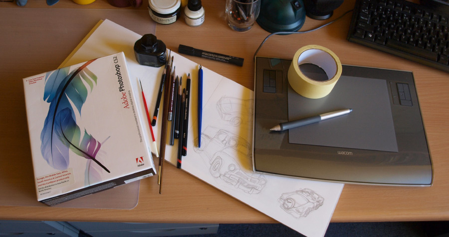
Let’s take a step into the digital realm, in the part 2 of this article! This part is obviously shorter, since there’s only the aspect of software and hardware, being the graphics tablet. The choices are pretty limited too, compared to amount of different art supplies, and brands that make them!
This was supposed to be a quick introduction to classic art tools, but it’s still pretty long due to the amount of material! ;) I’m writing down most common tools/mediums, my opinion and experience of it and sometimes even some brand recommendations. Highly recommend if you’re getting started, and jumping over from computer-made art (I actually did, few years ago).
This is a very broad and subjective subject, so in the end, you’re best off experimenting and trying out stuff on your own! Remember that the tools serve you and your vision, and will almost never make a picture for you! You’re the master of them, and your skills lie at the core. Also, I’m an advocate of the approach of looking for the items with best “price-to-quality” ratio – both buying very cheap and expensive might not be the best choice. Personally, I’ve learned the hard way, that expensive equipment doesn’t improve your skill, so keep that in mind. If you’re ready, read on!