
As you might know from my other tutorial, I create ny textures for my old school mods in grayscale most of the time. To add some color to them I use gradient maps, they’re also really great for adjusting the colors of your image to prepare it for 8-bit.
What are gradient maps?
Gradient maps are an image adjustment, available in the image → adjustments menu. They work by remapping the colors of your image to a gradient – blacks and whites becoming the extremes in the gradient. If you don’t understand, this image will hopefully illustrate:
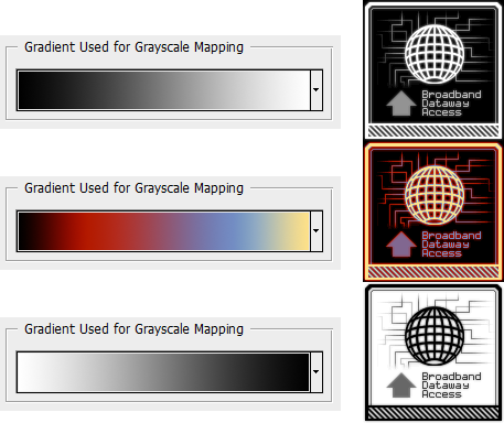
This should give you the idea, excuse the weird color scheme in the middle, I wanted to make the effect apparent.
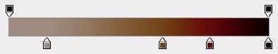
Of course, you don’t have to make your image grayscale manually – the effect works on color images, it just disregards hue and saturation, and takes only the value into account. This is the gradient map window itself:
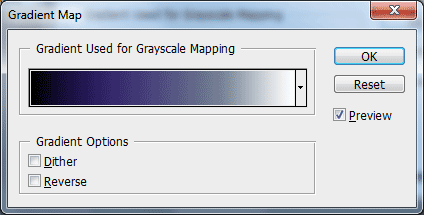
This is very simple. Clicking in the gradient let’s you edit it, the button to the right opens the list of preset gradients (You can create your own ones, save and load them), reverse reverses the gradient and dither provides some noise – this adds some variety to the pixels and make it look less linear, I usually don’t use it. The actual gradient editing dialog looks like this:
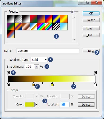
- This is where the preset gradients are available.
- This saves your current gradient as a new preset.
- Gradient type – there’s only two types available, solid which is a normal gradient and a noise type which just inputs random colors (customizable) throughout the ramp.
- Smoothness – 0% smoothness will give you a completely linear gradient, while 100% eases up the color transition between different colors. The actual gradient is very customizable, so I usually leave this option alone, but it’s useful in some cases.
- The stop points above the gradient are for opacity. For example, you can make the lightest pixels remap to an opaque color, while blacks and darks will become fully transparent.
- The bottom stops are for placing different colors. They are independent from the stops above.
- To place a new stop, just click above the gradient for an opacity change, and below for the color change. An already existing stop can be moved left and right.
- This is the 50% spot between two stops. Those can be moved left and right as well!
- This is where the you can set up the color, input the opacity and position value (This works the same as moving the stop with mouse, except more precise, since you input a percentage.). This works for current selected stop, you can select one by clicking on it. Delete will remove the current stop.
Gradient maps as adjustment layers
Not just gradient map, but all the adjustments from the image → adjustments menu can be placed as adjustment layers. You can do so by clicking on the split circle icon, on the bottom of the layer palette, and chose the adjustment you like.
I consider them vastly superior to normal adjustments, because of few reasons:
- They’re not permanently applied to the image, so you can always edit/tweak their settings.
- You can always make them invisible, use the opacity slider or duplicate them to decrease/intensify their effect.
- Can be selectively applied to the image – either by using masks or moving them in the layer stack (The effect is applied to all layers below it)
- You can copy them between documents – there’s no need to save presets, or memorize settings.
- You can place them in groups to reduce clutter, or to have a set of different adjustments you can turn on/off with a single click.
Okay, can we do something already?
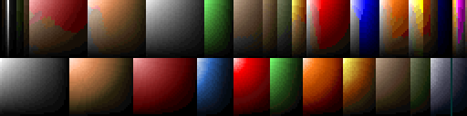
Yup! That should be enough introduction to the tools we will be using. As a first example, here’s a texture which uses Doom’s blue range, which is very saturated, a bit “neon” in it’s appearance, which often creates problems when converting to other palettes. I’ll try to convert it into Duke3d’s palette.
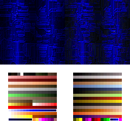
The original on the left, and converted to the right. I’ve highlighted the blue ranges used.
Eww. As you can notice, the Doom’s blue range converted mostly into the Duke’s neon blue ramp which consists of three shades… Besides the loss of detail and fidelity, in this particular case, those neon colors in Duke3d are full bright and will not be susceptible to shading in the engine, so this is completely not usable inside the game. The most reasonable thing, would be to use the available less-saturated blue range. You can mess around hue/saturation and other adjustments but why bother, when you can remap your image to the exact colors used in the palette?
In the gradient editing window, once you edit a color stop, you can pick colors either from the swatches palette or from the image itself, so it’s really good to have an graphic of your palette available – you can just alt + printscreen the image → mode → color table in a pinch. Usually, a minimal set-up works well – place the darkest and brightest color of a chosen color range on the edges, and the middle one in the center. Sometimes, you might need to move the outermost colors and move them towards the center, and place a true black and/or white on the edges – this depends both on the effect you want, and how the color ramp are set up in a current palette. Some games have their color ramps set up from pure white to black, other times, the pure white and black are a part of the gray range only. If the color changes it’s appearance throughout the ramp, your gradient map will need more color stops – colors picked at the beginning and end and at 1/4, 1/2 and 3/4 usually work well. (+ Extra white/black if needed). Of course you can pick as many as you want, pick more for a better color match.
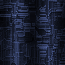
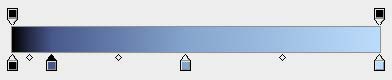
Since the gradient ramp adjustment interprets the source image as a black & white image, a straight gradient, with evenly spaced stops don’t work most of the time, as is the case with our example – since the neon blue is mostly blue channel only, it’s value is interpreted as quite dark. Here’s my result and my gradient map used to achieve it – in this case, I’ve lowered the smoothness to 0% in this case, mainly, because I’ve had to move the color stops closer to one end of the gradient.
But it doesn’t look the same!
Well, you’re right. Unfortunately, 8-bit palette forces you to compromise in one way or another. Of course, I recommend you always try converting first, and look at the results. But when something looks wrong, I recommend recoloring with gradient maps to conform to your chosen palette – I think it’s better to have a different hue, than to lose detail, end up with a dithered mess or other unexpected results. (Like colors reserved by the game/engine for specific purposes, for example). There’s also something that’s easy to miss, and you should take it into account – colormaps/lookup tables. Those tell the game/engine how the colors should behave in varying light levels, etc. As an example, here’s the Doom’s colormap, and one from Hacx 2.0 (It’s palette is derived from Doom’s)
Doom’s colors gray out in the dark a bit, and each color is darkened separately, while in Hacx 2.0, each color ramp darkens within it’s colors (when possible). It’s a good idea to know how it behaves – shade tables can ruin a potentially well converted graphic – okay looking texture may look ugly when seen in a dark room inside the engine.
So this means I have to stick to a single color ramp only?
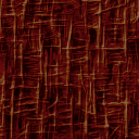
Not at all. It’s just you have to be extra careful in such cases. Usually, it’s hard to find colors which will convert well together, but it sometimes happens. ;) This is a fossilized/bone wall from Supplice, one of it’s color variants colored with a gradient map with a tan, brown and red shade.
That’s all?
I guess so. The coloring process works exactly the same, but you’re more likely to use some masking for your gradient maps. Quick tip: I recommend you make your selection first and then create an adjustment layer – it will automatically use the selection as the mask. As for the selection tools – if you’re converting one paletted image into a new palette, and there’s a problem with certain colors (Like for example, greens) you can use the magic wand tool, I recommend lower tolerance setting – it takes more time this way, but you’re less likely to select any shades you don’t want to adjust. In other cases, select → color range can be very helpful. If you’re using any other selection tools, like shape selection, or lasso/polygonal lasso, I recommend you leave antialiasing on – if the antialiasing of the gradient map layer mask produces some ugly colors after indexing, you can always use image → adjustments → threshold on the mask to convert it to a strict black & white image and remove the AA this way, or reduce the AA using levels adjustment and pushing the white and black sliders towards the center.
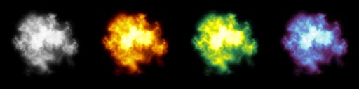
Besides palette-accurate colorization, gradient maps can be also used to great extent for colorization various effect sprites and particles:
Leave a Reply