If you ever worked on a mod for an old-game, or made your own, old-school styled one, I’m sure you’ve had to convert your artwork to an 8-bit, 256 colors max, palette – either because of the supported file format, or you just had to fit the artwork into already established palette. In Photoshop you do this through the image → mode → indexed color dialog. Let’s have a closer look at it, with all options explained.
Indexed color
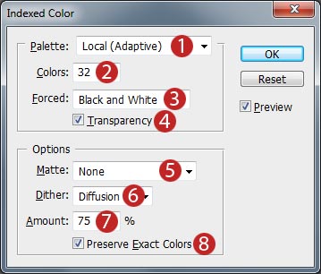
- Palette: This is where you can chose a palette to convert to, or chose what method the Photoshop should use to create one. The options available here are as follows:
- Exact: this option is only available when there’s exactly 256, or less than colors in the image. A new palette is created, and all colors present in the image fit inside, none of them are altered or discarded.
- System (MacOs), System (Windows), Web: those three are preset palettes, two system palettes of the 256 color modes of both Windows and Mac, and 216 colors which are the same between the two (web palette). The use of those is limited, and I’m pretty sure those are just kept for the legacy reasons.
- Uniform: in this mode, the value of each channel is divided into six – this means, that R, G or B channel can equal only to 1/6, 2/6, 5/6 etc. of the full value (255). All possible colors available within this limitation are saved into the palette, which results with a 216 color image at most. In general, this mode is pretty limited and I’ve never used it. As the above modes, guess it had it’s use on older software/hardware and it’s just a keepsake from the old versions of Photoshop.
- Local (perceptive, selective, adaptive): this mode converts the image to a new palette, taking only the currently selected image/document into account. Perceptive, selective and adaptive are the selection methods – this only matters if the image has more than 256 colors and the software has to pick which colors to keep and which to discard.
- Perceptive: focuses on keeping colors our vision is most sensitive to.
- Selective: focuses on keeping colors used over large, flat areas of the image (for example the red umbrella and the front of the wall in the kitty picture) and preserves web colors when they’re present.
- Perceptive: focuses on keeping colors used most times in the overal image.
- Master (perceptive, selective, adaptive): in general, the same as above, except it takes all open documents/images into account, while calculating the palette.
- Custom: this opens the color table dialog which allows you to define the whole pallete by hand, or import an already created one (loading the palette of the game you’re doing art for, for example), or save one. Photoshop supports it’s native .ACT palette format, .ACO format (the colors from the swatches palette can be saved and loaded in this format) or the Microsoft Palette .PAL format – despite the same extension, the Paint Shop Pro .PAL files are a different format and cannot be read by Photoshop!
- Previous: converts the image to the last palette used in the indexed color dialog – it doesn’t matter if it was a new palatte generated by Photoshop, one made by hand or one that you loaded from external file.
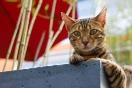
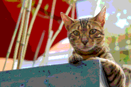
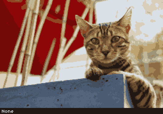
Here’s a demo of the uniform mode on a picture of a cool bengal cat. (Image courtesy of stock.xchng) - Colors: the color limit. This option is enabled when you convert your image into a new, generated palette. You can set it anywhere between 0 and 256.
- Forced colors: those colors will be present in your palette, no matter the conversion method, etc. There’s some default options like black & white, primaries (A set of few colors with either 0, or 255 in their RGB values), web (The 216 web colors), and custom option which lets you define forced colors manually. This can be pretty useful and can be used to augment the automatic conversion process.
- Transparency: leaving this option ticked will make sure that one of the color slots in your palette will be a transparent color.
- Matte: if you’re converting an image with transparent and semi-transparent pixels, you can choose a color which will serve as a background for the image. If the transparency checkbox is ticked, the matte color will be placed beneath the non opaque pixels, and fully transparent ones will have the transparent color.
- Dither: you can choose a method of dithering here – dithering is a method of placing pixels in a way that will create illusion of more colors, than are actually present. It was widely used in the age of EGA, CGA, and VGA graphics, less sharp CRT monitors of the time enhanced the effect further. Photoshop gives you the option of no dithering, noise dithering, pattern dithering (which is pretty close in appearance to hand-made dithering in pixel art), and diffuse dithering which is somewhere in-between. Here’s a comparison – I’ve converted the image to 16 colors to make the dithering more apparent:
The method you should use (if any dithering at all) depends on the circumstances and style you’re going for. You might prefer pattern dithering, but unfortunately, it tends to use some random color choices sometimes which can really take away the “human” aspect of it – check out the dark bluish gray pixels in the top of the picture, they don’t look that great. If you don’t really care about the patterns, diffuse dithering works really well, and noise looks worst in my opinion, and I never used it.
- Amount and 8. Preserve Exact Colors: – those are only applied with the diffuse option. Amount controls the amount of “diffusion” happening ;) and the preserve exact colors checkbox makes sure the pattern will not include colors which could be “out of place” in a certain area of image, I’ve always got it checked. Unfortunately, it only applies to diffuse dithering.
Editing the palette, and switching between ones
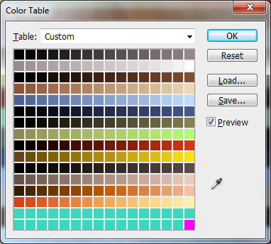
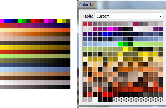
Once you convert your file, or open any other indexed color image, you can have the option to use image → mode → color table option. Looks like this:
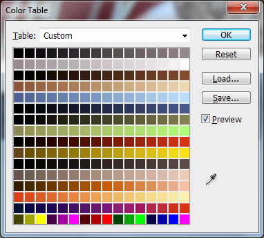
You can edit the colors manually here, pick a color to make it transparent using the eye dropper tool, save the current palette as a file and load a palette from file to replace the current one. If you hold alt, the cancel button will change into a reset button which will discard all changes without closing the dialog. Keep in mind, that loading the palette will replace the current one, not convert to the new one!
As you can see, the old colors are replaced with ones that occupy the same space in the new palette. If you want to convert to another palette, you have to return to RGB Color (image → mode → RGB color), and then use the indexed color option again.
Dealing with problematic colors
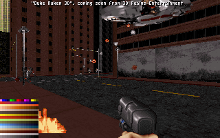
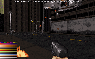
In cases of some palettes/games, there are colors you might not want to use, the indexing process will still take them into account. How to deal with this? I’ve thought of a simple method, let’s take Duke Nukem’s palette for example:
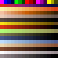
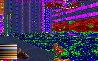
I’ve highlighted colors which I consider problematic. ;) The neon colors are full-bright – always displayed bright, no matter what the shading of the sprite/texture is set up in the game/engine. This is used for the enemies’ glowing eyes for example. Those colors are pretty distinct, so it’s easy to avoid them, but the red-blue range gave me a few headaches in the past.
Despite using gradient maps, with the colors picked only from the “proper” red range, the brightest colors of the blue-red/purple range, are so close they were spliced in over my image. While you can’t notice it just by looking at the image, the red-blue colors behave differently in the shade tables – this can result in blotches of darker red color, once you see your sprite or texture in game. The solution I came with, is to edit the palette inside the color table – just replace the colors that pose any problem with a new unique color.
In this case, turquoise works pretty well, there’s very slim chance something will remap to this color during indexing. Other palettes will most likely require a different color – it has to be a hue different from anything else available in the palette. Remember, that you can save your edited palette as a preset/file, and that you might not be able to get image in this palette into your game/engine of choice – just load back the “normal” palette.
Creating an ordered palette file
What if, you have your order palette as an image, and you’d like to create an .act palette file out of it? Unfortunately, this is impossible in Photoshop.
As you can see, the end result is completely useless to us.
Don’t fret my friends, we just have to get some third-party software to do this! ;) Personally, I use DoomCrap, which is neither crappy, or useful only with Doom. It’s three different tools, while two are geared towards use with Doom/ZDoom, the Palette Dump Tool is useful for everybody. The usage is pretty straightforward, you just need to have your ordered palette image saved as a file, select it in the software and click the dump palette button, it’s that easy.
Save for web
The file → save for web option, is an alternative save file dialog, it’s purpose is to save files optimized for websites, animated gifs, etc. The options for converting to index mode in case of .png and .gif formats are the same as listed above, but you can open a 2 or 4-window preview, each one of the same image, but you can compare different conversion options.
Conclusion
I think this covers all you should know when converting your artwork to 8-bit. If you have to conform to an already existing palette, it’s a good idea to tweak your colors for a better end result, I recommend you check out gradient maps tutorial for this purpose. :)
Leave a Reply